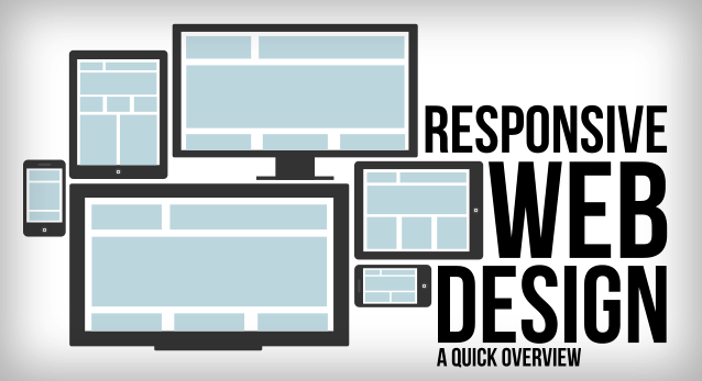
Running a successful web design company means never standing still, constantly learning about web design and mastering new web technologies as they become available. Lately, you may have heard the term Responsive Web Design thrown around in your marketing meetings. One of the latest buzz words, Responsive Web Design signifies a total paradigm shift in the design process. Similar to the impact that CSS had on the web design world, Responsive Web Design will alter the way we view and use sites. Smart web designers and and companies will quickly become familiar with it and put it into play.
In recent years, the internet has experienced a drastic rise in mobile website traffic. According to research firm Gartner, browser-equipped phones will outnumber traditional computers at some point during the year 2013. And although cellphones are yet to be users primary browsing device, Gartner projects users to make that transition by 2015.
This transition has propelled most companies in-the-know, to build versions of their website dedicated to mobile devices. The internet provides users with plenty of options, and website visitors now expect a positive experience. Oftentimes, elements of a desktop website are misaligned, unavailable, or are simply too small when browsed on a mobile device. This is not a knock on the original design, but visitors quickly translate this poor user experience with a company’s website. And thus the level of service or product-satisfaction they expect to receive.
With an ever-growing number and types of web-enabled devices, web designers must ensure an optimal user experience. Essentially there are two approaches for solving the multiple-devices dilemma.
The traditional method was to create multiple versions of a website, and then serve the appropriate versions based on the type of device being used by the visitor. This approach is relatively simple, as each version of the website exists independently of the others. Due to this separation, changes can be made to each version without affecting the others. However, this freedom comes at a fairly high price. First, designers have to design and build each version of the website. This isn’t just time-consuming for designers, but more expensive for clients. Additionally, as the number and types of devices continues to grow, it is becoming exceedingly difficult to address each one appropriately.
The new and improved approach to tackling the multiple-devices issue is responsive web design. When you boil down the differences between each web-enabled device, the most significant is screen resolution. This method allows for one website to, literally, transform itself based on the device on which it is being rendered.
In a previous article, we addressed the reasons we use CSS in our web design. With the release of the CSS3 specification, W3C created media queries which allow us to target various characteristics of the device being used, and conditionally apply certain styles based on those characteristics. Previously, some designers tested Javascript-dependent implementations of resolution-aware layouts. However, the advantage of the current CSS3 technology is that it allows us to look at more than one property in a single query. We are now able to test multiple property values and chain them into one query.
We can now serve different styles based on a set of defined rules. This ability gave rise to Responsive Web Design, as we can now have one website, respond to specific conditions and present itself in a way that promises optimal user experience. Images can be now be re-sized, columns moved and reordered, elements hidden, font-size altered, and more, all on the fly.
As we know, with great power comes great responsibility and this new flexibility is no different. We must now plan ahead and decide how we use fluid grids, flexible images and media queries to allow our layout to be molded with each viewing context.